Style X substance at SXSW
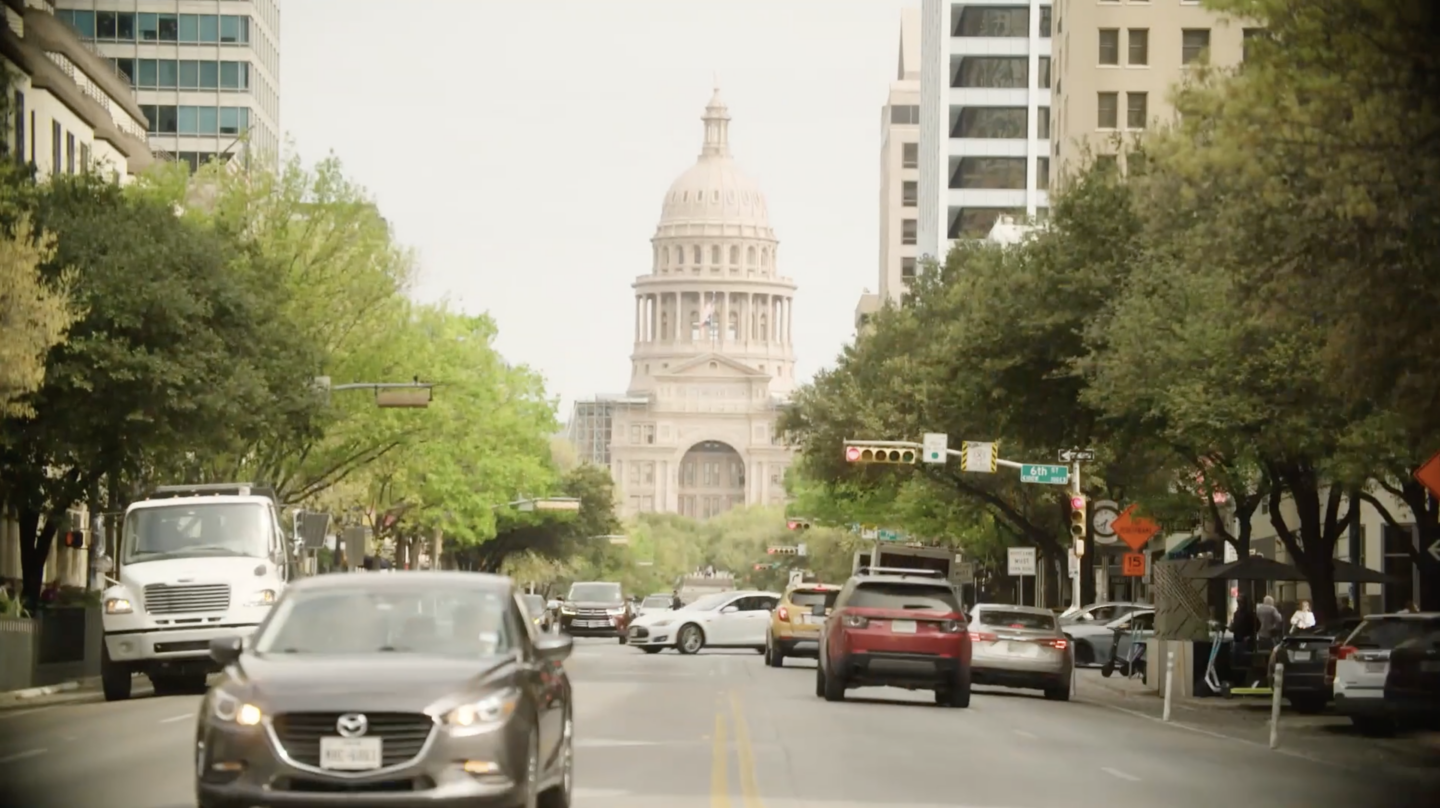
This month, I was on site at South by Southwest (SXSW) to deliver Shell House, a brand experience to engage attendees in Shell’s ongoing efforts to reach net zero. The SXSW festival is spread across the city of Austin and, during my breaks, I visited the neighbors to see how they had built their experiences.
Author:
Something struck me when I was checking out the competition. Experiential environments have to strike a balance – between style and substance.
Lean into a shiny aesthetic and attendees will have an enjoyable but “empty” experience: a pretty gift box with nothing inside. Get hung up on the details and attendees will turn their back on your wall of text or get overwhelmed with messaging and leave.
It’s important to control these two elements and not let one overpower the other. It isn’t meant to be style V substance. When they are balanced, their effect multiplies: style X substance.
The focus should always be “What’s in it for the attendee? How can we design and deliver an effective experience?”
Here are the signs that style and substance are out of balance – and recommendations to bring them back into harmony.

Crowd control and crabby expressions.
When your stand attracts people, more will follow. Congratulations, you’re drawing a crowd! But when they aimlessly hang about, gazing listlessly, it dawns on you… your “experience” is mere eye-candy. A disappointed delegate either steps into the space and then bounces – or, perhaps worse, shows keen by investing dwell time and ends up underwhelmed with what they got. This is a serious problem if it’s their first “in person” interaction with the brand.
Diagnosis: Too much style, not enough substance.
Solution: Design the delegate journey to deliver a worthwhile payoff. To prevent visitors from bouncing, create an easy in – a friendly conversation or a self-led interactive. Better yet, we recommend applying behavioral science to design content and experiences to meet attendee needs. To make sure they leave happy, train staff to tie up loose ends: “Were you satisfied with your visit? Is there anything else you wanted to know?”
Eyes averted or glazing over.
Content is key, and the format can either let it shine or let it down. Dense, dry information will test your audience’s attention span and cause fatigue – and that’s if they give it the time of day, because they have no stake in it and there is something much more fun to look at on the competitor’s lot across the road.
Diagnosis: Too much substance, not enough style.
Solution: Give your content curb appeal. Collaborate with creatives, UX experts, behavioral scientists, and 3D and graphic designers to make the content engaging – but not before you’ve taken careful steps to edit and chunk the information to make it digestible. Long-form information must have a reward or be rewarding in itself. Don’t make your attendee feel robbed of their time
How we balanced style and substance at Shell House.
We wanted to ride the line closely, since our venue was open to the public as well as badge holders. We had to design the experience to engage both audiences with the right level of content and let everyone learn something new about energy.
We achieved it with:
Style
- Honoring our venue to attract a crowd, we decided to fit into Antone’s historic Blues Bar, not skin it and hide its charm
- Connecting every touchpoint to the theme, NEXT/NOW, and setting a tone of energizing exploration
- Setting the tone for playful, interactive learning by presenting the “new” Shell with their new extended color palette, letting attendees set aside preconceived notions and open conversations about Shell’s future aspirations
Substance
- Respecting the audience’s attention with clear key messages and their intellect with deep-dive content
- Using our physical and digital UX expertise to design a simple attendee journey through five educational interactives
- Delivering information about Shell in an easy-to-understand format
- Bringing in external subject matter experts for panels, with Q&As from decarbonizing sports to agriculture
- Meeting people’s needs and wishes by creating a space to recharge and energize – themselves and their phones
Shell House had 3445 visitors, 3179 of which explored the “recharge lounge” and interactives, and 2834 of which completed the digital engagements. Out of 11 talks on the main stage, 5 of them were a full house.
Check out our highlights below.

What would I have done differently?
Next time, I would use more of the illustrative style that we used on the interior, outside. It helped soften the corporate brand with an unexpected playfulness. It would have been a benefit to our audience to set that tone with the view from the curb.
A critical look at the competition.
Having visited the neighbors, I have mixed reviews of the way brands showed up to SXSW.
I visited a famous streaming platform where they had installed various photo ops based on upcoming original series: a drive-in theater had attendees hop into a classic car; a room filled with security cameras made you feel “watched” by the government from a thriller series. All of them sent a selfie with a themed filter to your phone – a quick win.
But I didn’t learn anything about the premise or plot through these photo op activations. They paraded the aesthetic of the shows but wasted the opportunity to tell a story – not even screening trailers. The role of reps was reduced to selfie support when they ought to have been brand ambassadors and storytellers. For me, this was a missed opportunity.
All style and no substance.
On the flip side, I visited an A/V tech company who had planned their attendee journey and shown care for their audience. They designed the space to let people experience their offering rather than explain it in long paragraphs. I spent a while checking out their immersive installations, showcasing how their technology can be applied in different settings.
One room was fully surrounded by screens and mirrors, with AI-generated video synced to music, giving the impression of a much larger space while enveloping you in sound. I got the message that, with their surround sound, every seat is the best seat in the house. Further interactives showed how their tech can be brought into your home, your car, and gaming all through experiential educational play.
This had style and substance.

My advice.
If you need an experience designed, talk to an experiential agency. Our focus is not just on stand-out creative and high-production value, but on taking a strategic approach through UX, research and insights, and behavioral science to bring your experience to life – this is our AXD (attendee experience design) approach.
“Style over substance” may draw attention… but an environment is not just an advertisement. Every visit to your space is an experience that can (and should) deliver more for attendees – the chance to interact, discover stories, and make memories.
Let’s see what next year’s SXSW brings.


