
Four creative shifts from ESMO: What’s next for experiential design in pharma
Explore four key experiential design trends from ESMO 2025 reshaping pharma congress booths through bold storytelling, immersive tech, and brand-focused creativity.
Author:
Katie Streten, Head of Creative Strategy
Each year, ESMO (European Society for Medical Oncology Congress) offers more than a view into the latest in oncology — it’s also a pulse check on how healthcare brands are choosing to show up. Beyond the science, it’s where storytelling, technology, and human connection intersect. Wandering the exhibition hall this year, I found that the design trends emerging in pharma are speaking louder, feeling warmer, and connecting more deeply than ever.
Here are four creative shifts that caught my eye.
Massive screens deliver impact.
Large screens are still popular for effective storytelling. Flexibility of storytelling, beautiful showcase opportunities for AORs and the promise of a brand agnostic experience that is fit for purpose lead to its continued popularity. Emotional storytelling is at the heart of this bold move.
Novartis employed a very interesting approach, reflecting the ‘good news’ story at the heart of their Kisqali campaign. The emotional connection generated in a physical hug was mirrored through the use of massive screens with a curved shape, like a hug. This offered space for interactivity connected to the campaign and also forced perspective screen opportunities that then add to the memorability.
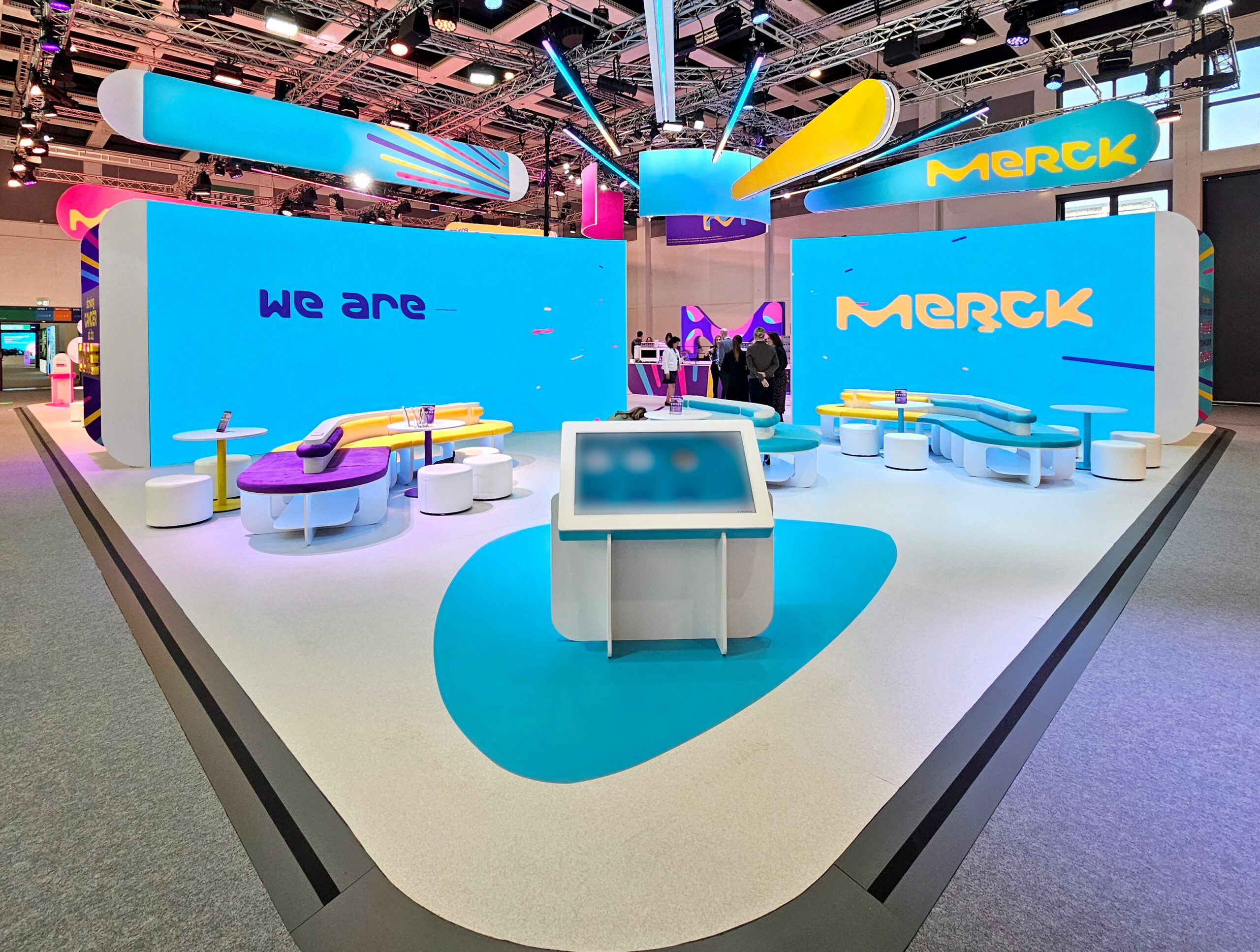
Merck used massive, curved screens too but they were used to create a more open and expansive feeling on the stand. Clever use of content moving from one screen to the next delivered a sense of progression and story.
Both of these examples bring together brand, product and architecture. They are working together to drive impact and create memorability which we know drives commitment.
Pared back planting.
Where brands have been leaning heavily into foliage to create a welcome and natural feeling environment, this is beginning to be dialled back. Plants are now accents, they don’t overwhelm the experience.
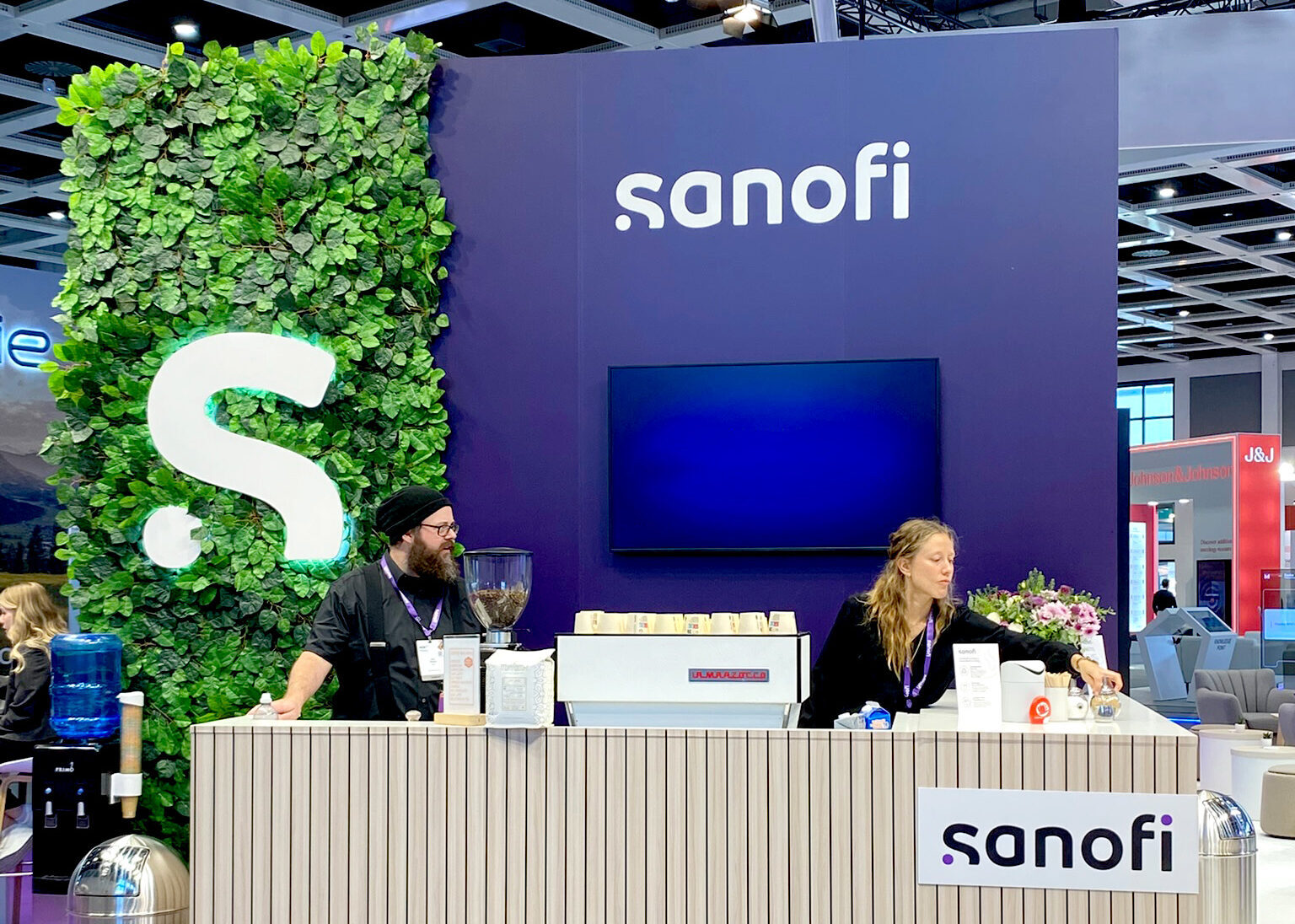
A good example is Sanofi. At ASCO 2025, Sanofi’s signature foliage wall was far larger and there was more planting in general across the stand, while at ESMO the wall was more pared back, while still present. Bristol Myers Squibb had gone for small but elegant table arrangements while Menarini useda small number of rubber plants where needed.
Brands are realising that more is not more. Foliage remains important but should be used in the right places, for example in the business suites or private areas where a more intimate feel is required. On booth, in public, there is value in investing more in content than planting.
Colour with confidence colour principle.
For a long time, Congress was a sea of blue and white. Now brands are increasingly leaning into their colours – moving away from traditional pharma colours and recognising the value in the accent colours of their own colour palettes. Brands that embrace the power of colour carve a unique space for themselves in the hall.
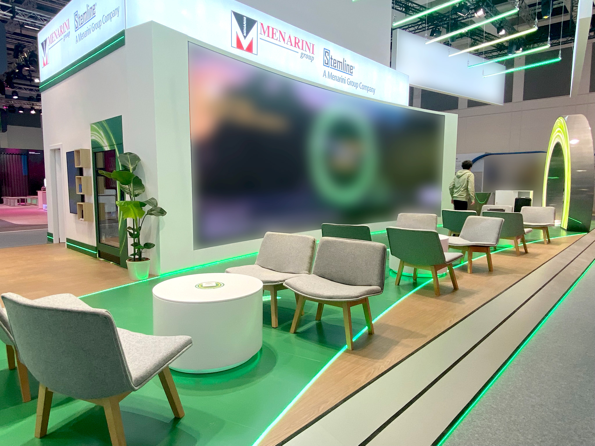
Menarini made striking use of their colour palette to delineate Medical and Commercial. The Commercial space used a large arch in green and the floor used green linoleum in cut outs surrounded by wood. These sections were picked out with green LED, an interesting use of lighting at a low level. The same approach was mirrored in blue on the Medical space. The whole impression was striking and different.
AstraZeneca created a dramatic and intimate impression with the use of their grey and magenta which marked them out as unique in the hall, while GSK fully embraced the vibrancy of their orange across screens and architecture to provide contrast to interactives and seated areas.
Colour is intimately tied to your brand, it’s an expression of who you are. As brands lean more into colour they become more distinctive and attractive – two characteristics you need to drive conversations and learning in a busy congress hall.
Intrigue to engage.
Sculpture and analogue interaction are joining VR and digital engagements. The best of them create an inviting space that attracts attendees and makes it easy for them to engage, learn and dwell.
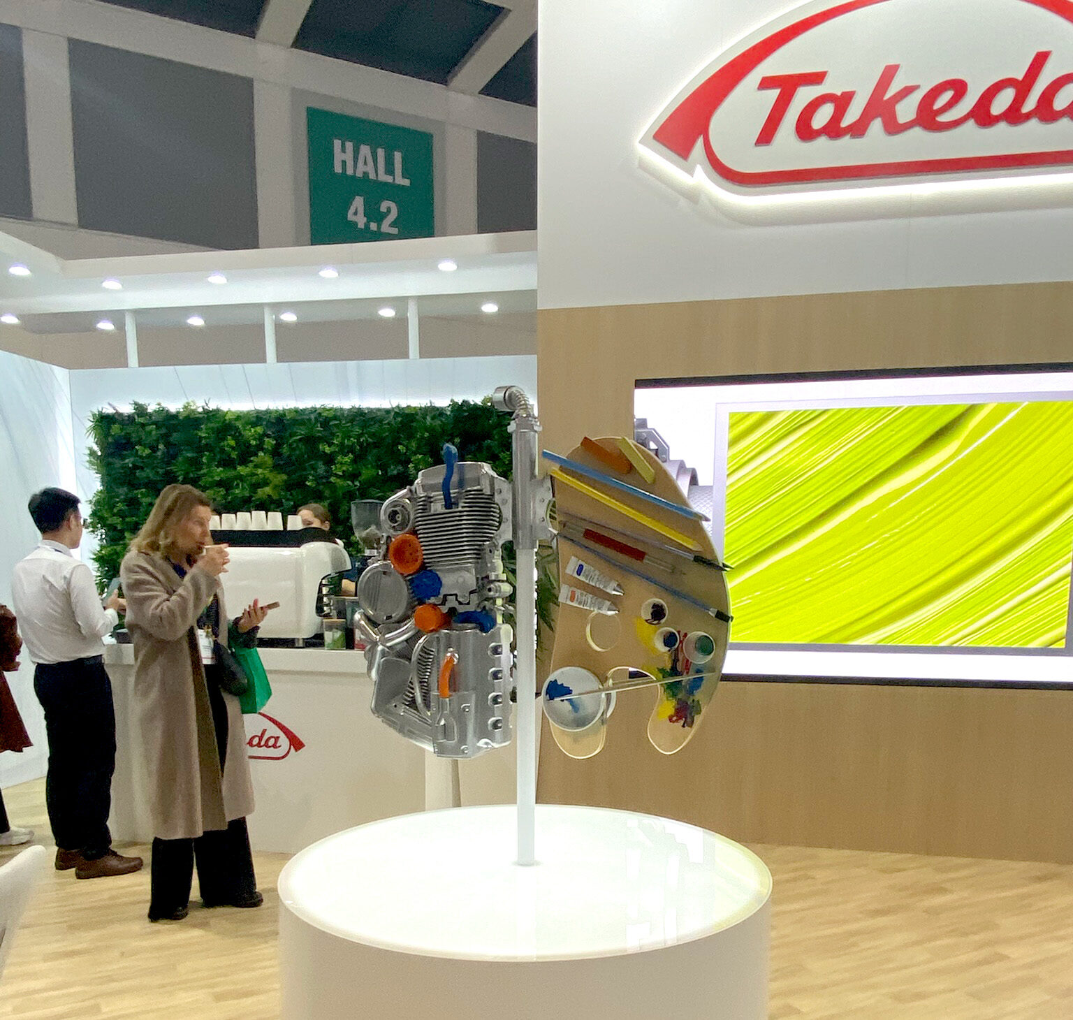
Ipsen had a sculpture designed to look like a woman melting that reflected their campaign, Takeda had a sculpture of the lungs with one side made from car parts and the other from an easel and paint materials. Novartis had a thread of commitment wall asking delegates to wind a thread around their person commitments to breast cancer. Merck had a colouring wall that spoke to their brand positioning.
The main thing is that while VR and touchscreens are fantastic ways to deliver complex information and a technological wow, analogue interactions can be enticing because they require us to search out their meanings or to physically engage with them to bring value. In either case good user experience testing and sometimes facilitation are crucial.
The takeaway.
ESMO 2025 showed us that the future of congress design isn’t about more technology or bigger screens. It’s about balance — between the digital and the tangible, between clarity and emotion. For us at Emota, that’s the sweet spot: where creativity meets connection, and science becomes an experience people can truly feel.
Discover how our wider Inizio teams are reimagining congress engagement – from scientific storytelling to design innovation – at inizio.com.
Where next?
-
More than décor: How every theme can tell a story
-
Discover the future of congress experiences
-
The business case for sustainable events